Update v2.0 - Dark Mode
Aseprite 95 Theme » Devlog

It took quite some time but finally, a massive update for Aseprite 95 is ready, there are many changes here that will make the theme much nicer to use without compromising the aesthetic.
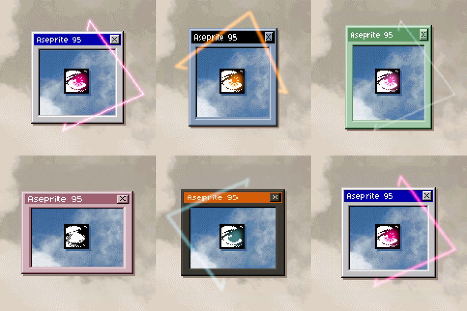
There are new graphics for the combo boxes, all buttons are now much more responsive, and the most important feature is the Dark Mode, with two unique theme variants - Midnight and Gruvbox.
The standard theme also got four new variants offering a unique, low-contrast look.
I hope you’ll enjoy this one! ✌️
Changes:
- [Feature] Added two dark theme variants - Midnight and Gruvbox
- [Feature] Added four new light theme variants - Teal, Slate, Spruce, Lilac
- [Fix] Radio Button has the correct color in variants
- [Fix] Scrollbar background no longer has a gap under it
- [Fix] Drop Pixel icons are correctly placed in the center of the button
- [Fix] Status Bar and Separator text uses a correct color with an adjusted margin
- [Improvement] Added new graphics for the combo boxes
- [Improvement] Cleaned up the Zoom Tool icon
- [Improvement] Introduced accent colors for Eggplant, Rainy Day, and Rose variants
- [Improvement] Added a unique eye icon color for each variant
- [Improvement] Changed button graphics to convey responsiveness better
- [Improvement] Introduced unique icon color for all variants for better contrast
Files
Aseprite 95 Theme v2.0 228 kB
Jul 16, 2023
Get Aseprite 95 Theme
Download NowName your own price
Aseprite 95 Theme
Run Aseprite like it's 1995
More posts
- Update v2.1 - Catching up to AsepriteMar 20, 2025
- Aseprite 95 - Release v1.0May 02, 2023

Comments
Log in with itch.io to leave a comment.
Great stuff
This update feels explicitly targeted towards me... I had already started learning how to modify this amazing themeset to add precisely these two variants (I use gruvbox everywhere).
What an amazing update. Thank you!
Great stuff.